Kriativ Co. · Magnetic Brand Masterclass follow-up
The Referral Click The referral click (0:00 to 0:50) Make your brand the obvious choice the moment a referral opens your site. If your offer has outgrown your site, the next person a client refers should see why they sent them before they scroll. I'll show you how I'd fix that in the next six minutes.
A client sends someone your link and says, "Talk to them. They're great at this." Then that person opens your site on their phone. The first thing they see could be from any business in your category. Now they have to work out why they were sent to you in the first place.
I'm Kri, the creative director at Kriativ Co. If you came from my Magnetic Brand Masterclass, this is where we take the idea into the actual build.
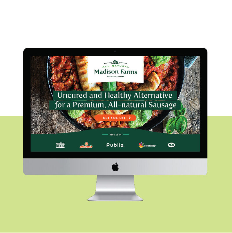
This is the Madison Farms website my team built. On a cap, the name and color help you recognize the brand. A first-time visitor to the website needs more. The product photo and headline tell you what they sell, and the orange button gives you the next step. By the end I'll show you how to find the equivalent on your own site.
Website Madison Farms The product, its point of difference and the next action share the first screen.
The gap (0:50 to 1:58) Think about the last really good referral you got. The person who sent it probably had a reason. They said something specific about the project you helped with or the kind of client you understand. I want one referral sentence to become the brief for the identity and the first screen. Then every design choice has something to answer to.
Here's a made-up example. On one site it says, "We help businesses grow." On the other it says, "We build bookkeeping systems for studios hiring their first team." If I'm the owner of a studio with my first hire coming up, I know immediately why my friend sent me the second link.
You can give the first business a gorgeous new logo and put that same line right underneath it. Now it looks better and I still have to guess. That's the trap when the homepage rewrite, the logo and the rest of the brand all start from separate briefs.
I bring the reason someone would pick you into three decisions in this order. First the strategy. Then the identity that makes it feel like your business. Then the website that turns that same reason into a next step. That's the order behind the Obvious Choice build.
Start with strategy (1:58 to 2:57) The first decision is what you want to be picked for. If you've been in business a while, you've probably collected offers and audiences along the way. A new visitor needs somewhere to start. Give the offer you want to grow the clearest introduction.
Start by looking at a real client introduction. If the sentence begins with "I sent you to them because," whatever comes after that is worth paying attention to. They tend to get to the point faster than a founder who's trying to fit their whole history on the homepage.
In the bookkeeping example, the first hire gives the design team something to work with. The page can show what changes when payroll becomes part of the week. You can decide which proof belongs near the top. All of that gets harder when the brief is just "make it feel premium."
If your offer is clear and the right clients already recognize you, the work may be about carrying what works onto the site. If the clients you're trying to reach have changed, the brief starts there. That decision saves a lot of arguments about fonts later.
Build the identity (2:57 to 3:57) Now my team has something to design around. Color, type, photography and the way the pieces sit together tell a visitor what sort of business they've found before they've read every line. Those choices get easier to judge when you know the feeling the brand needs to leave behind.
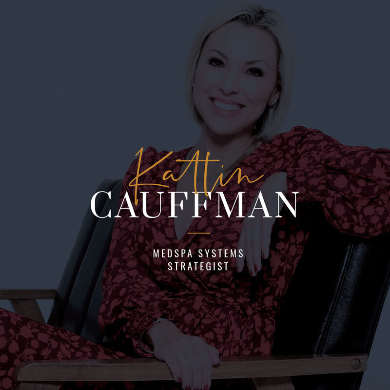
This is the Katlin Cauffman identity from our portfolio. Look at the first phrase under Katlin's name. It tells a medspa owner the specialty right away. The handwritten name gives it a personal feel, and the role still has a clear place on the screen.
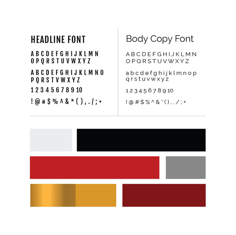
Now look at the Joe Dillon identity next to it. The type and colors here give a different team a starting point. The palette and headline type are easy to pick out, which matters when someone else has to create the next piece.
The test I care about is what happens after handoff. When your team needs to make a sales deck or a new landing page, they should have enough direction to make it feel like you. That's where the identity system and guidelines earn their keep.
Brand identity Katlin Cauffman The first line under the name makes the specialty clear.
Brand identity Joe Dillon A clear type and color system gives the team a starting point for each new asset.
Carry it through to the site (3:57 to 4:58) Then we carry the identity onto the site. I want the first screen to make sense even if you never get the chance to explain it in a voice note. The visitor should understand what you do for them, see a reason to believe it and know where to go next.
Back to the Madison Farms site. Look at how the green identity, the product photo and the headline carry the same idea into the site. Then the orange button gives the eye somewhere to go. On your own homepage, check that the same order holds up on a phone.
Open your homepage on a phone and stop before you scroll. If the best referral you ever got were looking at that screen, what would tell them they'd landed in the right place? If the answer takes three scrolls or a trip to the about page, you've found a concrete place to start.
If a visitor needs to see that you've done their kind of project, put the most relevant example near the first decision you ask them to make. They can go through the whole portfolio later. The first example has one job, which is to make that next click feel like a sensible one.
Website Madison Farms The product, its point of difference and the next action share the first screen.
Working together (4:58 to 6:12) If your offer is ready and you'd like a creative team to build this, apply to work with me. At Kriativ Co. we can take the brand strategy into the identity, then carry it into a website or funnel. What we build depends on what you already have and where the gap is.
This is for a business that's ready to invest in the build. You might have a site that still describes what you did two offers ago. Or you might have a launch planned and know what you're selling. If you're still choosing the offer or want to make the assets yourself, keep working through the masterclass first.
When you apply, tell me what you sell, where people land today and what you need the new brand or site to do. My team will review your application and reach out about next steps. The application starts a conversation about scope. If we talk, we'll use your current link and project goals to work out where we can help.
The next time someone sends you a good referral, the page should pick up where that introduction left off. If you're ready for my team to build that with you, tap "Apply to work with me" below this video and tell me what the next version of your business needs.
Apply to work with me